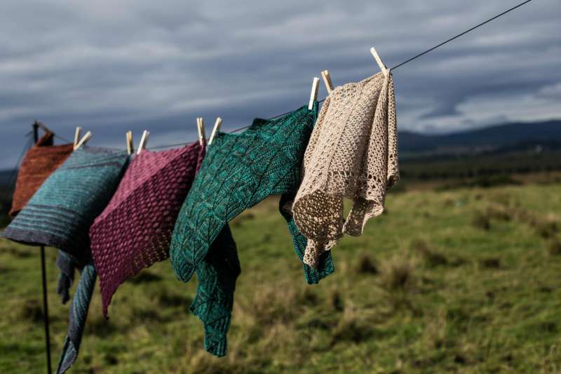
If you want your crochet or knit colour work to have maximum impact you need to choose yarns that contrast. Whether you are working in stripes, stranding or working motifs, if you want the yarns to make a clear visible pattern you'll want a high contrast between the tones.
Some yarn choices can look great together in the skein but when you start working the pattern you realise that they merge into one, especially when seen from a distance.
So I wanted to share with you one quick tip to avoid this.
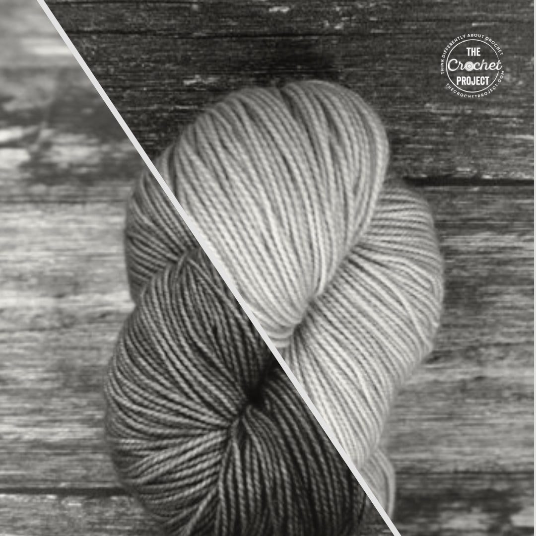
Take a picture of the yarns, you'd like to use. And pop a greyscale filter on it.

You can see that even though these two colours (Aventurine and Carnelian*) look very different to one another they have a similar tone and this is very obvious in black and white.

Whereas although these colours (Lepidolite and Chryso*) are different tones and so would be a better choice for colourwork that pops.
Of course, you can use this tip in reverse if you want your yarn choices to harmonise, if you want to blend one to the other with stripes that fade then choose colours that look very similar to each other when you put a greyscale filter over them.
Of course I'd always recommend swatching to make sure you will get the result you want but this tip can help you narrow down your choices before you get to the swatching phase.
*yarns used are all Coop Knits, Socks Yeah! yarn (4ply)
Leave a comment
All comments are moderated before being published.
This site is protected by hCaptcha and the hCaptcha Privacy Policy and Terms of Service apply.